The Secret of the Apple’s New San Francisco Fonts
iOS 9 is now publicly released. It’s a subtle change but the system fonts of iOS 9 are now changed to the Apple’s new San Francisco fonts, replacing the previous Helvetica Neue.

San Francisco fonts have been used in Apple Watch already, and San Francisco is now the standard font unifying the Apple platform: Apple Watch, iPhone, iPad and Mac.

Apple has been using Helvetica as the system fonts for iOS since the first iPhone, and they also switched the fonts from Lucida Grande to Helvetica for Mac OS X since 10.10 Yosemite. Why did Apple decide to ditch Helvetica, which is the most famous and loved font in the world?
Helvetica is weak in small sizes
It is said that Helvetica is not suited for texts in small sizes. When the system fonts for Mac OS X Yosemite are changed to Helvetica, many designers claimed that Helvetica is not appropriate one.

You can see the low legibility of Helvetica if you type texts in a small size and make them blur. Some texts become blended and hard to decipher. They say that Apple developed San Francisco fonts in order to make small size texts in Apple Watch more legible.

But nowadays, smart devices have more resolution than paper printing, and texts in iPhone are not always as small as in Apple Watch. Why Apple changed the system fonts for iOS and Mac OS X, not only for Apple Watch?
San Francisco is not a single font
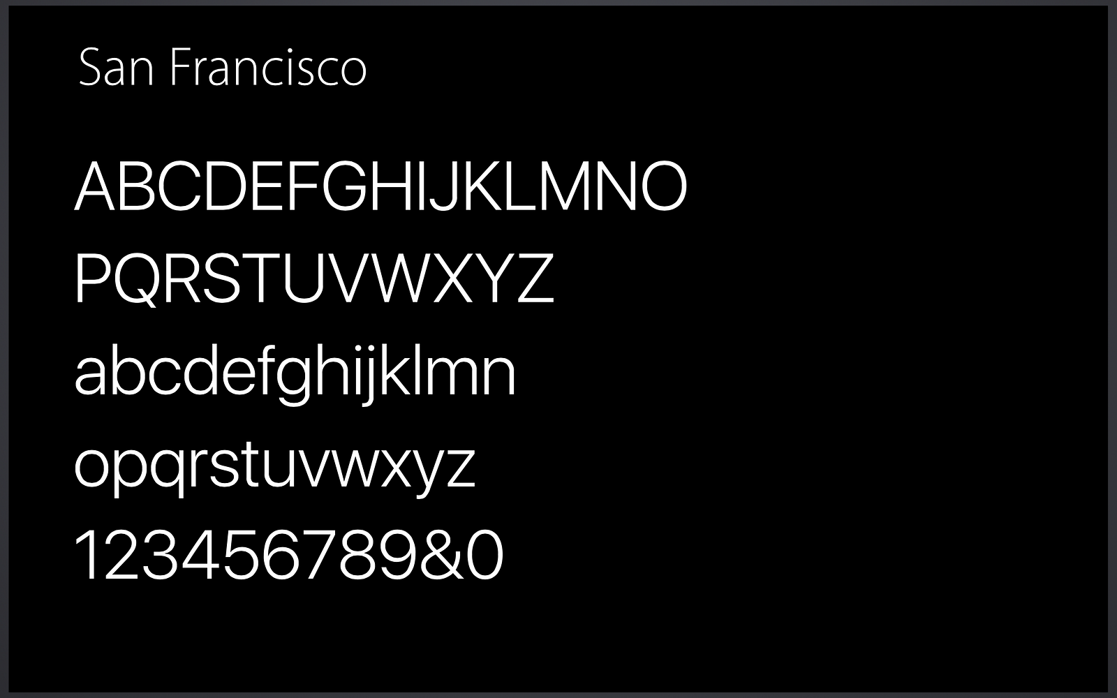
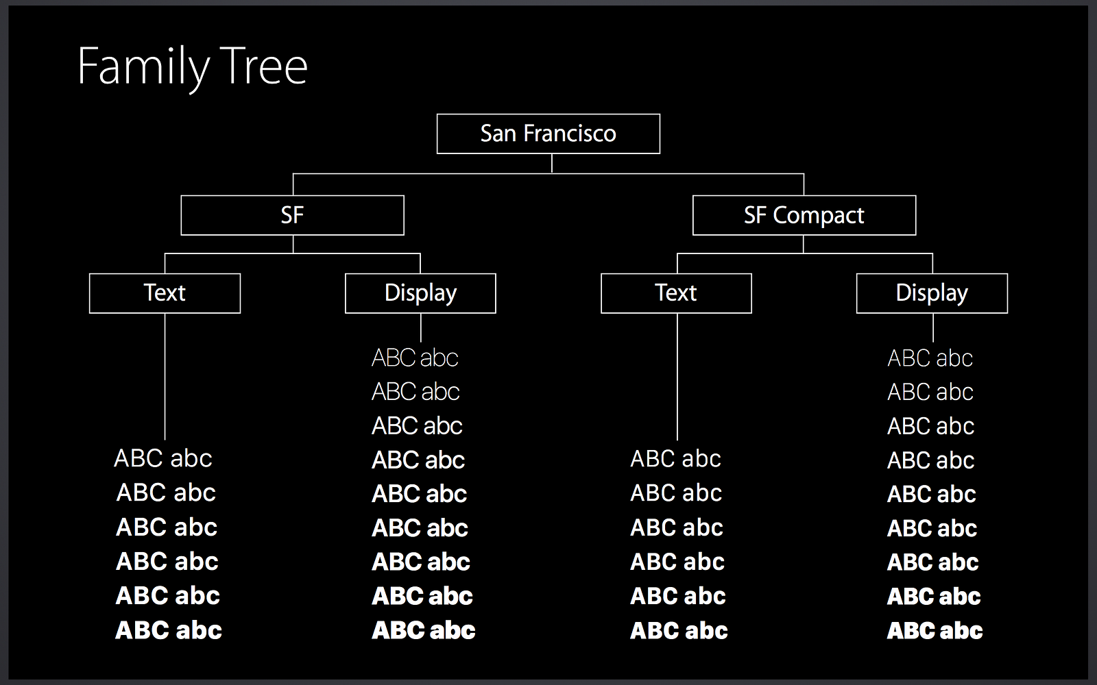
San Francisco fonts have lots of features to be highly legible. In fact, the San Francisco fonts for Apple Watch and for iOS/Mac are not same.
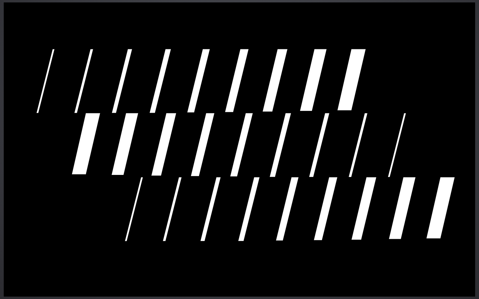
The font family named “SF” is used for iOS/Mac and “SF Compact” is for Apple Watch. You can see the difference in round shaped letters like ‘o’, ‘e’. SF compact has rather flat vertical lines than that of SF.


This difference gives texts in SF Compact more margins between letters, resulting in high legibility in small devices like Apple Watch.
In addition, SF and SF Compact fonts are divided into two sub font families named “Text” and “Display”. This is what Apple calls “Optical Sizes”. The Text fonts are for smaller texts, and the Display fonts for bigger.
As I mentioned above, with grotesque (or sans serif) fonts like Helvetica, two adjacent letters become “blended”, and letters like ‘a’, ‘e’, ‘s’ looks similar in small sizes.

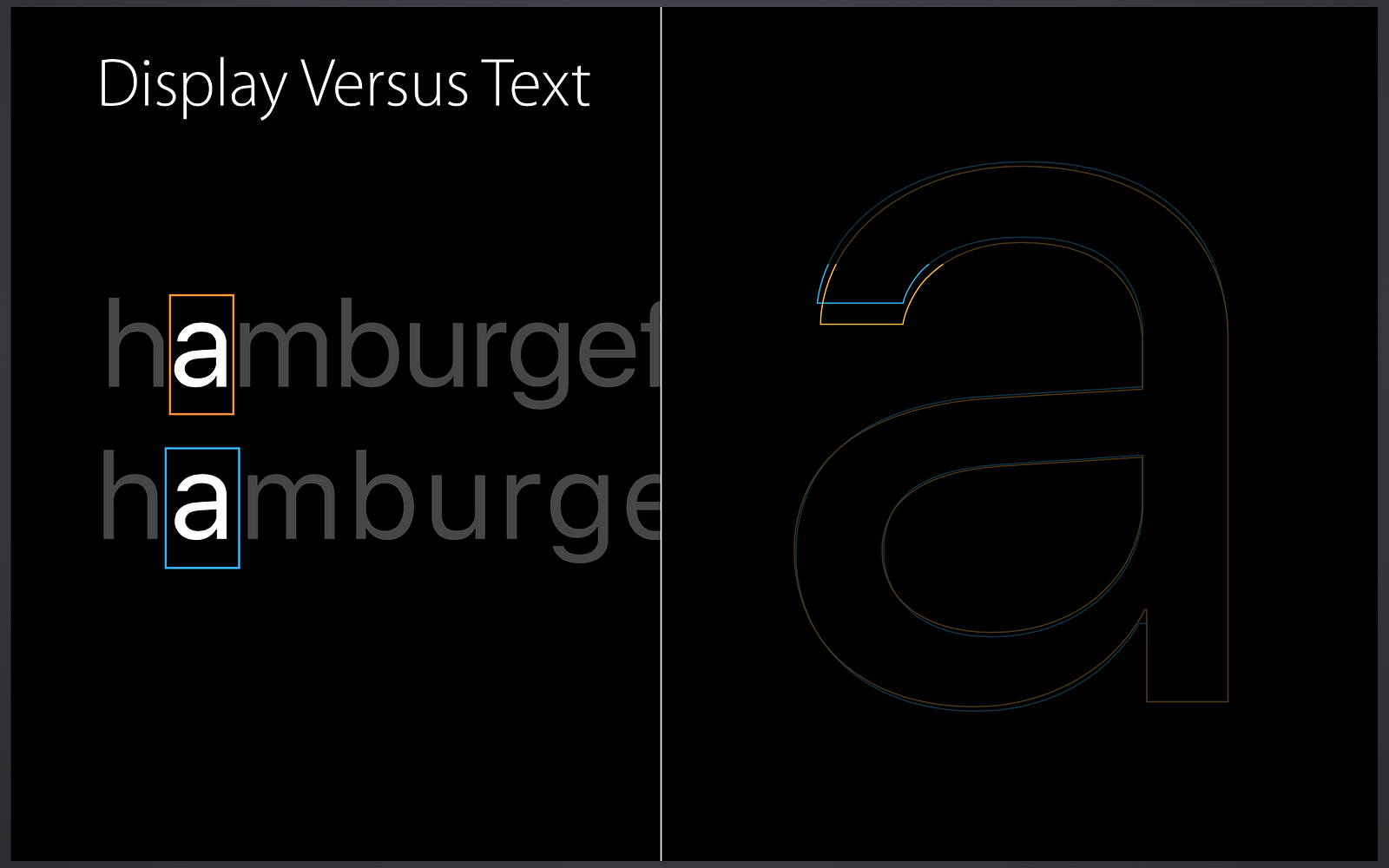
The San Francisco Text fonts, which are used for texts in small sizes, are designed to have more margins than the Display fonts. And the apertures of the Text fonts are also wider in order to be legible in small sizes.
San Francisco fonts are dynamic
One of the great features of San Francisco is the way it optimizes the typeface dynamically. The system will automatically switch the Display/Text fonts according to the text size. Specifically, 20pt is the boundary.

Designers and engineers don’t have to care about which font to use. Just set the system fonts to UILabel for example, and then the system will give you an appropriate typeface for you.
What have impressed me about San Francisco fonts is the way colons (:) are displayed. Basically, a colon will be placed right above the baseline, so it’s not vertically centered if it is placed between numbers. San Francisco fonts, on the other hand, will make it vertically centered automatically.

San Francisco is the font for digital age
As you see, San Francisco fonts are carefully designed to be easy to read in any text size and on any device.
Helvetica, which was replaced by San Francisco fonts, was created in Switzerland in 1957, when there were no digital devices. Helvetica is widely used by many companies as the corporate type even now, and no doubt it will be used in the future as a great classic font.
San Francisco, on the other hand, is a modern font. It will change the typefaces dynamically according to the context. It is a kind of “Digital Native” fonts for the digital age.